Columns can be grouped in the grid's header using Column Groups. Column groups can be shown as open / closed to show / hide child Columns.
Column Groups are configured by providing a hierarchy of Column Definitions. If a Column Definition contains the children attribute then the grid treats it as a Column Group.
const gridOptions = {
    columnDefs: [
        {
            headerName: 'Name & Country',
            children: [
                { field: 'athlete' },
                { field: 'country' }
            ]
        },
        {
            headerName: 'Sports Results',
            children: [
                { columnGroupShow: 'closed', field: 'total' },
                { columnGroupShow: 'open', field: 'gold' },
                { columnGroupShow: 'open', field: 'silver' },
                { columnGroupShow: 'open', field: 'bronze' },
            ],
        }
    ],

    // other grid options ...
}
Set the attribute columnGroupShow on the group's children to set the expand and collapse policy as follows:
'open': The child is only shown when the group is open.'closed': The child is only shown when the group is closed.null,undefined: The child is always shown.
See Group Column Properties for all available properties.
Group Defaults Copy Link
Use defaultColGroupDef to set properties across all Column Groups.
const gridOptions = {
    defaultColGroupDef: {
        headerName: 'A shared prop for all Groups'
    },

    // other grid options ...
}
Multiple Levels Copy Link
The example below demonstrates a grid with many column group header levels. Note the following:
- The API is used to open and close groups. To do this, you will need to provide your groups with an ID during the definition, or look up the groups ID via the API (as an ID is generated if you don't provide one).
- The
colGroupDef.openByDefaultproperty is set on the E and F groups, resulting in these groups appearing as open by default. defaultColGroupDefanddefaultColDefare used to apply a class to some of the headers. Using this technique, you can apply style to any of the header sections.
Groups & Column Pinning Copy Link
Pinned columns break groups. So if you have a group with 10 columns, 4 of which are inside the pinned area, two groups will be created, one with 4 (pinned) and one with 6 (not pinned).
Groups & Column Moving Copy Link
If you move columns so that columns in a group are no longer adjacent, then the group will again be broken and displayed as one or more groups in the grid.
Sometimes you want columns of the group to always stick together. To achieve this, set the column group property marryChildren=true. The example below demonstrates the following:
- Both 'Athlete Details' and 'Sports Results' have
marryChildren=true. - If you move columns inside these groups, you will not be able to move the column out of the group. For example, if you drag 'Athlete', it is not possible to drag it out of the 'Athlete Details' group.
- If you move a non group column, e.g. Age, it will not be possible to place it in the middle of a group and hence impossible to break the group apart.
- It is possible to place a column between groups (e.g. you can place 'Age' between the 'Athlete Details' and 'Sports Results').
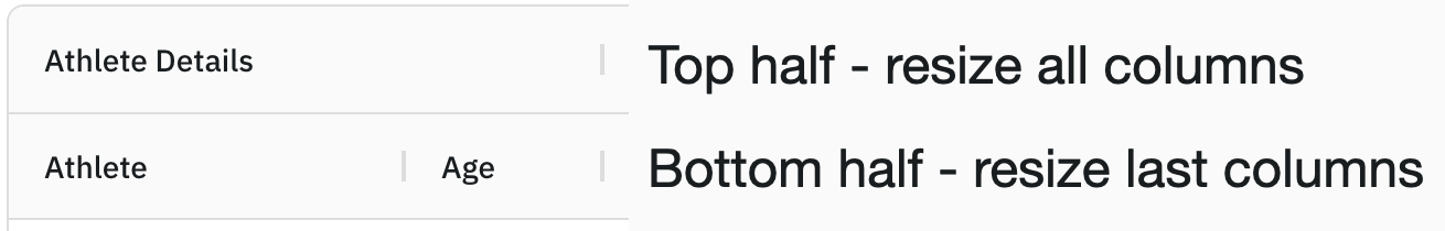
Resizing Groups Copy Link
If you grab the group resize bar, it resizes each child in the group evenly distributing the new additional width. If you grab the child resize bar, only that one column will be resized.
Auto Header Height Copy Link
The header row for the column groups can have its height set automatically based on the content of the group header cells. This is most useful when using the wrapHeaderText column group property.
To enable this, set autoHeaderHeight=true on the column group definition you want to adjust the height for. If more than one column group has this property enabled, then the header row will be sized to the maximum of these column groups' header cells to avoid content overflow.
The example below demonstrates using the autoHeaderHeight property in conjunction with the wrapHeaderText property, so that long column group names are fully displayed.
- Note that the long column group header names wrap onto another line
- Resize a column group down by dragging the resize handle on the column group header or child column headers left. Observe that the group header row will expand so the header cell content is still fully visible as it's getting wrapped on multiple lines.
Colouring Groups Copy Link
The grid does not automatically colour the groups for you. However, you can achieve this by using the headerClass or headerStyle properties in the column definitions. These attributes can be applied to both individual columns and column groups.
columnDefs: [
    // the CSS class name supplied to 'headerClass' will get applied to the header group
    { headerName: 'Athlete Details', headerClass: 'my-css-class', children: [] },
    { headerName: 'Medal Details', headerStyle: { backgroundColor: 'green' }, children: [] }
],
Text Alignment Copy Link
The labels in the grouping headers are positioned with display: flex. To make the group headers right-aligned, add the following rule set in your application, after the grid's style sheets:
.ag-header-group-cell-label {
    flex-direction: row-reverse;
}
Sticky Label Copy Link
When Column Groups are too wide, the Header Label is always visible while scrolling the grid horizontally. To suppress this behaviour, set the column group property suppressStickyLabel=true. The example below demonstrates the following:
- Both 'Athlete Details' and 'Sports Results' have
suppressStickyLabel=true. - If you scroll the grid horizontally, the header label will not remain visible as the column is partially scrolled out of view.
Group Changes Copy Link
Similar to adding and removing columns, you can also add and remove column groups. If the column definitions passed in have column groups, then the columns will be grouped to the new configuration.
The example below shows adding and removing groups to columns. Note the following:
- Select No Groups to show all columns without any grouping.
- Select Participant in Group to show all participant columns only in a group.
- Select Medals in Group to show all medal columns only in a group.
- Select Participant and Medals in Group to show participant and medal columns in groups.
- As groups are added and removed, note that the state of the individual columns is preserved. To observe this, try moving, resizing, sorting, filtering etc and then add and remove groups, all the changed state will be preserved.
The example above shows adding and removing groups. It is also possible to add and remove columns from groups. This is demonstrated in the example below. Note the following:
- The example has two groups: Athlete Details and Sports Results
- The example has two sets of columns, Normal Cols and Extra Cols.
- When you move from Normal Cols to Extra Cols, three new columns are added to the list. Two belong to the Athlete Details group, the other belongs to no group.
Column Height Copy Link
By default the grid will resize the header cell to span the whole height of the header container, as shown in the example below.
Note the following:
- The Age column header cell is not under a column group cell, but spans the entire height of the header container.
Using the Column Property suppressSpanHeaderHeight the Grid will balance the column headers with different number of levels with an empty column group header cell, as shown in the example below.
const gridOptions = {
    columnDefs: [
        {
            headerName: 'Athlete Details',
            children: [
                { field: 'athlete' },
                { field: 'country' },
            ],
        },
        {
            field: 'age',
            width: 90,
            suppressSpanHeaderHeight: true,
        }
    ],

    // other grid options ...
}
Note the following:
- The Age column has an empty column group header cell above it (shown with red borders).
Hide Padded Header Rows Copy Link
When using column groups the grid adds padding to columns to ensure the column tree is balanced. When a column with a deeper tree is hidden, this can lead to header rows consisting entirely of padding. Set the hidePaddedHeaderRows grid option to true to hide rows consisting of only padding.
The example above demonstrates a grid with hidden column groups, causing the grid headers to be taller than necessary when the parent group is collapsed.
Tooltips Copy Link
Tooltips can be added to the Column Group Headers by using the headerTooltip property of the ColGroupDef.
The example below demonstrates using the headerTooltip property in the grid column groups.
Inner Header Group Component Copy Link
When using the Header Group Component, the agColumnHeaderGroup component will display the header group name, adjacent to the expand / collapse button.
This text value can be overridden with a Custom Component by setting the innerHeaderGroupComponent and innerHeaderGroupComponentParams properties on the headerGroupComponentParams property. This is useful when you only need to implement a Component to customise the Column Group Name without having to reimplement the other header group functionality such as the expand / collapse.
colDef = {
    ...
    headerGroupComponentParams : {
        innerHeaderGroupComponent: MyInnerHeaderGroupComponent,
        innerHeaderGroupComponentParams: {
            currencySymbol: '£' // the pound symbol will be placed into params
        }
    }
}
Implement this interface to provide a custom inner header component.
IInnerHeaderGroupComponent Copy Link
interface IInnerHeaderGroupComponent<TData = any, TContext = any, TParams extends Readonly<IHeaderGroupParams<TData, TContext>> = IHeaderGroupParams<TData, TContext>> {
  // Return the DOM element of your component, this is what the grid puts into the DOM
  getGui(): HTMLElement;

  // Gets called once by grid when the component is being removed; if your component needs to do any cleanup, do it here
  destroy?(): void;

  // The init(params) method is called on the component once.
  init?(params: TParams): AgPromise<void>  |  void;

}
IHeaderGroupParams Copy Link
The column group the header is for. |
The text label to render. If the column is using a headerValueGetter, the displayName will take this into account.
|
Opens / closes the column group |
Sets a tooltip to the main element of this component.
value The value to be displayed by the tooltip
shouldDisplayTooltip A function returning a boolean that allows the tooltip to be displayed conditionally. This option does not work when enableBrowserTooltips={true}.
|
Callback to request the grid to show the column menu. Pass in an html element to have the grid position the menu over the element. If provided, the grid will call onClosedCallback when the menu is closed. Note that this only works with the new column menu.
|
Callback to request the grid to show the column menu. Similar to showColumnMenu, but will position the menu next to the provided mouseEvent. If provided, the grid will call onClosedCallback when the menu is closed. Note that this only works with the new column menu.
|
The component to use for inside the header group (replaces the text value and leaves the remainder of the Grid's original component). |
Additional params to customise to the innerHeaderGroupComponent. |
The header the grid provides. The custom group header component is a child of the grid provided header. The grid's header component is what contains the grid managed functionality such as resizing, keyboard navigation etc. This is provided should you want to make changes to this cell, eg add ARIA tags, or add keyboard event listener (as focus goes here when navigating to the header).
|
The grid api. |
Application context as set on gridOptions.context. |
Selecting Components Copy Link
By default the grid uses the provided Header Group Component. To use a Custom Group Component set headerGroupComponent on the Column Definition.
const colDefs = [{
    headerName: "Athlete Details",
    headerGroupComponent: MyCustomGroupComp, // Custom Comp
    children: [
        {field: "name"},
        {field: "country"}
    ]
}]
See Registering Components for an overview of registering components.
Custom Group Component Copy Link
The example below shows a Custom Column Group Component.
As with Column Headers, the grid will always handle resize and column moving. The Custom Component is responsible for the following:
- Group Open / Close: If the group can expand (one or more columns visibility depends on the open / closed state of the group) then the Custom Component should handle the interaction with the user for opening and closing groups.
The Header Group Component interface is as follows:
interface IHeaderGroupComp {
    // optional method, gets called once with params
    init?(params: IHeaderGroupParams): void;

    // can be called more than once, you should return the HTML element
    getGui(): HTMLElement;

    // optional method, gets called once, when component is destroyed
    destroy?(): void;
}
The params passed to init(params) are as follows:
Properties available on the IHeaderGroupParams<TData = any, TContext = any> interface.
The column group the header is for. |
The text label to render. If the column is using a headerValueGetter, the displayName will take this into account.
|
Opens / closes the column group |
Sets a tooltip to the main element of this component.
value The value to be displayed by the tooltip
shouldDisplayTooltip A function returning a boolean that allows the tooltip to be displayed conditionally. This option does not work when enableBrowserTooltips={true}.
|
Callback to request the grid to show the column menu. Pass in an html element to have the grid position the menu over the element. If provided, the grid will call onClosedCallback when the menu is closed. Note that this only works with the new column menu.
|
Callback to request the grid to show the column menu. Similar to showColumnMenu, but will position the menu next to the provided mouseEvent. If provided, the grid will call onClosedCallback when the menu is closed. Note that this only works with the new column menu.
|
The component to use for inside the header group (replaces the text value and leaves the remainder of the Grid's original component). |
Additional params to customise to the innerHeaderGroupComponent. |
The header the grid provides. The custom group header component is a child of the grid provided header. The grid's header component is what contains the grid managed functionality such as resizing, keyboard navigation etc. This is provided should you want to make changes to this cell, eg add ARIA tags, or add keyboard event listener (as focus goes here when navigating to the header).
|
The grid api. |
Application context as set on gridOptions.context. |
Not all column groups can open and close, so you should display open / close features accordingly. To check if a column group should have open / close functionality, check the isExpandable() method on the column group.
const showExpandableIcons = params.columnGroup.isExpandable()
To check if a column group is open or closed, check the isExpanded() method on the column group.
const groupIsOpen = params.columnGroup.isExpanded();
To open / close a column group, use the params.setExpanded(boolean) method.
// this code toggles the expanded state
const oldValue = params.columnGroup.isExpanded();
const newValue = !oldValue;
params.setExpanded(newValue);
To know if a group is expanded or collapsed, listen for the expandedChanged event on the column group.
// get a reference to the original column group
const columnGroup = params.columnGroup.getProvidedColumnGroup();
// create listener
const listener = () => { console.log('group was opened or closed'); };
// add listener
columnGroup.addEventListener('expandedChanged', listener);

// don't forget to remove the listener in your destroy method
columnGroup.removeEventListener('expandedChanged', listener);
Dynamic Tooltips Copy Link
When using Custom Header Components it might be necessary to have a better control of how Tooltips are added instead of simply using the headerTooltip config. For this purpose, we provide the setTooltip method.
Properties available on the IHeaderGroupParams<TData = any, TContext = any> interface.
Sets a tooltip to the main element of this component.
value The value to be displayed by the tooltip
shouldDisplayTooltip A function returning a boolean that allows the tooltip to be displayed conditionally. This option does not work when enableBrowserTooltips={true}.
|
The example below demonstrates using the Dynamic Tooltips with a Custom Group Component.
- Note that only Group Headers where the text is not fully displayed will show tooltips.