AG Grid is a high-performance React Data Grid library for building React Tables with unbeatable performance and hundreds of features. Available in Community and Enterprise editions. Visit Community vs. Enterprise to learn more.
Create a React Data Grid Copy Link
Add AG Grid to your application in 60 seconds:
NPM Install Copy Link
Install the ag-grid-react package, which also installs ag-grid-community:
npm install ag-grid-reactProvide Modules Copy Link
Pass the AllCommunityModule to the AgGridProvider to access all Community features:
import { AllCommunityModule } from 'ag-grid-community';
import { AgGridProvider } from 'ag-grid-react';

const modules = [AllCommunityModule];

function App() {
    return (
        <AgGridProvider modules={modules}>
            {/* Your AgGridReact components go here */}
        </AgGridProvider>
    );
}
To minimize bundle size, only provide the modules you want to use. See the Modules docs for more information.
Import the React Data Grid Copy Link
import { AgGridReact } from 'ag-grid-react'; // React Data Grid ComponentDefine Rows and Columns Copy Link
const GridExample = () => {
    // Row Data: The data to be displayed.
    const [rowData, setRowData] = useState([
        { make: "Tesla", model: "Model Y", price: 64950, electric: true },
        { make: "Ford", model: "F-Series", price: 33850, electric: false },
        { make: "Toyota", model: "Corolla", price: 29600, electric: false },
    ]);

    // Column Definitions: Defines the columns to be displayed.
    const [colDefs, setColDefs] = useState([
        { field: "make" },
        { field: "model" },
        { field: "price" },
        { field: "electric" }
    ]);

    // ...
}React Data Grid Component Copy Link
Return the AgGridReact component inside AgGridProvider, wrapped in a parent container div with a fixed height:
const modules = [AllCommunityModule];

return (
    <AgGridProvider modules={modules}>
        {/* Data Grid will fill the size of the parent container */}
        <div style={{ height: 500 }}>
            <AgGridReact
                rowData={rowData}
                columnDefs={colDefs}
            />
        </div>
    </AgGridProvider>
)Example React Data Grid Copy Link
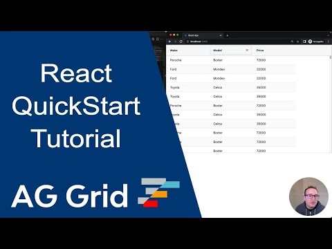
Below is a live example of the application running. Click </> Code to see the code.
To live-edit the code, open the example in CodeSandbox or Plunker using the buttons to the lower-right.
Next Steps Copy Link
Now that you have a basic React Data Grid running, choose one of the following options to continue your learning journey: