You can create your own Custom Components to customise the behaviour of the grid. For example you can customise how cells are rendered, how values are edited and also create your own filters.
The full list of component types you can provide in the grid are as follows:
- Cell Component: To customise the contents of a cell.
- Header Component: To customise the header of a column.
- Inner Header Component: To customise the inner header of a column.
- Header Group Component: To customise the header of a column group.
- Inner HeaderGroup Component: To customise the inner header component of a column group.
- Edit Component: To customise the editing of a cell.
- Filter Component: For custom column filter that appears inside the column menu.
- Floating Filter: For custom column floating filter that appears inside the column menu.
- Date Component: To customise the date selection component in the date filter.
- Menu Item Component: To customise the items within grid menus.
- Loading Component: To customise the loading cell row when using Server Side row model.
- Overlay Component: To customise loading, no rows, no matching rows and exporting overlay components or provide a custom overlay.
- Status Bar Component: For custom status bar components.
- Tool Panel Component: For custom tool panel components.
- Tooltip Component: For custom cell tooltip components.
The remainder of this page gives information that is common across all the component types.
Registering Custom Components Copy Link
There are two ways to register custom components:
- Direct reference.
- By name.
1. By Direct Reference Copy Link
When registering an Angular Component by reference you simply pass the Component to the place you want it used (i.e. Cell Renderer, Filter etc).
In this example we're specifying that we want our Angular CubeComponent as a Cell Renderer in the Cube column:
//...other imports
import { Component } from '@angular/core';
import { CubeComponent } from './cube.component';

@Component({
selector: 'app-root',
template: `
  <ag-grid-angular [columnDefs]="columnDefs"
                   ...other properties />
`
})
export class AppComponent {
  columnDefs: [
      {
          field: "cube",
          cellRenderer: CubeComponent,
      }
  ]

  //...other properties & methods
}
The advantage of referencing Components directly is cleaner code, without the extra level of indirection added when referencing by name.
2. By Name Copy Link
When registering an Angular component by name you need to first register the component within the grid components property, then reference the component by name where you want it used (i.e. as a Cell Renderer, Filter etc).
In this example we've registered our Angular CubeComponent and given it a name of cubeComponent (this can be any name you choose). We then specify that we want the previously registered cubeComponent to be used as a Cell Renderer in the Cube column:
//...other imports
import { Component } from '@angular/core';
import { CubeComponent } from './cube.component';

@Component({
selector: 'app-root',
template: `
  <ag-grid-angular [columnDefs]="columnDefs" [components]="components"
                   ...other properties />
`
})
export class AppComponent {
  components = {
      'cubeComponent': CubeComponent
  };
  columnDefs = [
      {
          field: "cube",
          cellRenderer: 'cubeComponent',
      }
  ]

  //...other properties & methods
}
The advantage of referencing components by name is definitions (eg Column Definitions) can be composed of simple types (ie JSON), which is useful should you wish to persist Column Definitions.
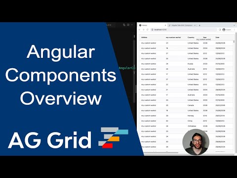
Clicking on the Push For Total button will log results in the developer console.
Providing Additional Parameters Copy Link
Each Custom Component gets a set of parameters from the grid. For example, for Cell Component the grid provides, among other things, the value to be rendered. You can provide additional properties to the Custom Component (e.g. what currency symbol to use) by providing additional parameters specific to your application.
To provide additional parameters, use the property [prop-name]Params, e.g. cellRendererParams.
<ag-grid-angular
    [columnDefs]="columnDefs"
    /* other grid options ... */ />

this.columnDefs = [
    {
        field: 'price',
        cellRenderer: PriceCellRenderer,
        cellRendererParams: {
            currency: 'EUR'
        }
    },
];
Component Lifecycle Hook agInit Copy Link
Each custom Angular component must implement the agInit(params) lifecycle hook. AgInit is called by AG Grid before any of the Angular Lifecycle hooks, including ngOnInit. This order is deterministic and applies to all component types.
Mixing JavaScript and Angular Copy Link
When providing Custom Components you have a choice of the following:
- Provide an AG Grid component as an Angular Component.
- Provide an AG Grid component in JavaScript.
The following code snippet shows how both JavaScript and Angular Components can be used at the same time:
//...other imports
import { Component } from '@angular/core';
import JavascriptComponent from './JavascriptComponent.js';
import { AngularComponent }  from './angular.component';

@Component({
selector: 'app-root',
template: `
  <ag-grid-angular [columnDefs]="columnDefs" [components]="components"
                   ...other properties />
`
})
export class AppComponent {
  // JS and Angular components, only need register if looking up by name
  components = {
      'javascriptComponent': JavascriptComponent,
      'angularComponent': AngularComponent
  };
  columnDefs = [
      {
          headerName: "JS Cell",
          field: "value",
          cellRenderer: 'javascriptComponent', // JS comp by Name
      },
      {
          headerName: "JS Cell",
          field: "value",
          cellRenderer: JavascriptComponent, // JS comp by Direct Reference
      },
      {
          headerName: "Angular Cell",
          field: "value",
          cellRenderer: 'angularComponent', // Angular comp by Name
      },
      {
          headerName: "Angular Cell",
          field: "value",
          cellRenderer: AngularComponent, // Angular comp by Direct Reference
      }
  ];

  //...other properties & methods
}
Javascript components are run outside of NgZone. If they initiate calls into your Angular application you may need to wrap these calls within ngZone.run() for Change Detection to correctly run.
Change the documentation view to JavaScript to see how to create a plain JavaScript component.
Child to Parent Communication Copy Link
There are a variety of ways to manage component communication in Angular (shared service, local variables etc), but you often need a simple way to let a "parent" component know that something has happened on a "child" component. In this case the simplest route is to use the Grid's context feature to hold a reference to the parent, which the child can then access.
//...other imports
import {Component} from '@angular/core';
import {ICellRendererAngularComp} from 'ag-grid-angular';
import {CubeComponent} from './cube.component';

@Component({
  selector: 'app-root',
  template: `
      <ag-grid-angular [context]="context" /* ...other properties */ />
  `
})
export class AppComponent {
  constructor() {
      this.context = {
          componentParent: this
      }
  }

  parentMethod() {
      // do something
  }
  //...other properties & methods
}

@Component({
  selector: 'cell-renderer',
  template: `
      ...component template...
  `
})
export class CellRendererComponent implements ICellRendererAngularComp {
  params: any;
  componentParent: any;

  agInit(params) {
      this.params = params;
      this.componentParent = this.params.context.componentParent;
      // the grid component can now be accessed - for example: this.componentParent.parentMethod()
  }

  //...other properties & methods
}
Note that although we've used componentParent as the property name here it can be anything - the main point is that you can use the context mechanism to share information between the components.
Component Usage Copy Link
The below table gives a summary of the components, where they are configured and using what attribute.
| Component | Where | Attribute |
|---|---|---|
| Cell Component | Column Definition | cellRenderer cellRendererParams cellRendererSelector |
| Editor Component | Column Definition | cellEditor cellEditorParams cellEditorSelector |
| Filter | Column Definition | filter filterParams |
| Floating Filter | Column Definition | floatingFilter floatingFilterParams |
| Date Component | Column Definition | dateComponent dateComponentParams |
| Header Component | Column Definition | headerComponent headerComponentParams |
| Inner Header Component | Column Definition | innerHeaderComponent innerHeaderComponentParams |
| Header Group Component | Column Definition | headerGroupComponent headerGroupComponentParams |
| Inner Header Group Component | Column Definition | innerHeaderGroupComponent innerHeaderGroupComponentParams |
| Tooltip Component | Column Definition | tooltipComponent tooltipComponentParams |
| Group Row Cell Component | Grid Option | groupRowRenderer groupRowRendererParams |
| Group Row Inner Cell Component | cellRendererParams groupRowRendererParams | innerRenderer innerRendererParams |
| Detail Cell Component | Grid Option | detailCellRenderer detailCellRendererParams |
| Full Width Cell Component | Grid Option | fullWidthCellRenderer fullWidthCellRendererParams |
| Loading Cell Component | Grid Option Column Definition | loadingCellRenderer loadingCellRendererParams |
| Overlay Component | Grid Option | overlayComponent overlayComponentParams overlayComponentSelector |
| Active Overlay | Grid Option | activeOverlay activeOverlayParams |
| Drag and Drop Image | Grid Option | dragAndDropImageComponent dragAndDropImageComponentParams |
| Status Bar Component | Grid Option -> Status Bar | statusPanel statusPanelParams |
| Tool Panel | Grid Option -> Side Bar | toolPanel toolPanelParams |
| Menu Item | Grid Option -> Menu | menuItem menuItemParams |
Grid Provided Components Copy Link
The grid comes with pre-registered components that can be used. Each component provided by the grid starts with the namespaces 'ag' to minimise naming conflicts with user provided components. The full list of grid provided components are in the table below.
| Drag And Drop | |
|---|---|
| agDragAndDropImage | Default cover element when grid parts are being dragged |
| Date Inputs | |
|---|---|
| agDateInput | Default date input used by filters |
| Column Headers | |
|---|---|
| agColumnHeader | Default column header |
| agColumnHeaderGroup | Default column group header |
| Column Filters | |
|---|---|
| agSetColumnFilter (e) | Set filter (default when using AG Grid Enterprise) |
| agTextColumnFilter | Simple text filter (default when using AG Grid Community) |
| agNumberColumnFilter | Number filter |
| agDateColumnFilter | Date filter |
| agMultiColumnFilter (e) | Multi filter |
| agGroupColumnFilter (e) | Group column filter |
| Floating Filters | |
|---|---|
| agSetColumnFloatingFilter (e) | Floating set filter |
| agTextColumnFloatingFilter | Floating text filter |
| agNumberColumnFloatingFilter | Floating number filter |
| agDateColumnFloatingFilter | Floating date filter |
| agMultiColumnFloatingFilter (e) | Floating multi filter |
| agGroupColumnFloatingFilter (e) | Floating group column filter |
| Cell Components | |
|---|---|
| agAnimateShowChangeCellRenderer | Cell Component that animates value changes |
| agAnimateSlideCellRenderer | Cell Component that animates value changes |
| agGroupCellRenderer | Cell Component for displaying group information |
| agLoadingCellRenderer (e) | Cell Component for loading row when using Enterprise row model |
| agSkeletonCellRenderer | Cell Component for displaying skeleton cells |
| agCheckboxCellRenderer | Cell Component that displays a checkbox for boolean values |
| Overlays | |
|---|---|
| agLoadingOverlay | Loading overlay |
| agNoRowsOverlay | No rows overlay |
| agNoMatchingRowsOverlay | No matching rows overlay |
| agExportingOverlay | Exporting overlay |
| Cell Editors | |
|---|---|
| agTextCellEditor | Text cell editor |
| agSelectCellEditor | Select cell editor |
| agRichSelectCellEditor (e) | Rich select editor |
| agLargeTextCellEditor | Large text cell editor |
| agNumberCellEditor | Number cell editor |
| agDateCellEditor | Date cell editor |
| agDateStringCellEditor | Date represented as string cell editor |
| agCheckboxCellEditor | Checkbox cell editor |
| Master Detail | |
|---|---|
| agDetailCellRenderer (e) | Detail panel for master / detail grid |
| Column Menu / Context Menu | |
|---|---|
| agMenuItem (e) | Menu item within column or context menu |
Overriding Grid Components Copy Link
It is also possible to override components. Where the grid uses a default value, this means the override component will be used instead. The default components, where overriding makes sense, are as follows:
- agDragAndDropImage: To change the default drag and drop image when dragging grid parts.
- agDateInput: To change the default date selection across all filters.
- agColumnHeader: To change the default column header across all columns.
- agColumnGroupHeader: To change the default column group header across all columns.
- agLoadingCellRenderer: To change the default loading cell renderer for Enterprise Row Model.
- agSkeletonCellRenderer: To change the default skeleton loading cell renderer for Enterprise Row Model.
- agLoadingOverlay: To change the default 'loading' overlay.
- agNoRowsOverlay: To change the default 'no rows' overlay.
- agNoMatchingRowsOverlay: To change the default 'no matching rows' overlay.
- agExportingOverlay: To change the default 'exporting' overlay.
- agCellEditor: To change the default cell editor.
- agDetailCellRenderer: To change the default detail panel for master / detail grids.
- agMenuItem: To change the default menu item for column and context menus.
- agTooltipComponent: To change the default tooltip component for all tooltips.
To override the default component, register the custom component in the GridOptions components property under the above name.
@Component({
    selector: 'my-app',
    template: `
        <ag-grid-angular
            [components]="components"
            ...other properties...
        />
    `
})
export class AppComponent {
    // Here is where we specify the components to be used instead of the default
    public components = {
        agDateInput: CustomDateComponent,
        agColumnHeader: CustomHeaderComponent
    };