
This page covers the key concepts of AG Grid: A high performance, feature rich, Angular Data Table and Angular Data Grid.

Your First Angular Grid
Add AG Grid to your application in these steps:
1. NPM Install
npm install ag-grid-angular
2. Import the Angular Grid
import { Component } from '@angular/core';
import { AgGridAngular } from 'ag-grid-angular'; // Angular Data Grid Component
import { ColDef } from 'ag-grid-community'; // Column Definition Type Interface
3. Define Rows and Columns
@Component({
 selector: 'app-root',
 standalone: true,
 imports: [AgGridAngular], // Add Angular Data Grid Component
 styleUrls: ['./app.component.css'],
 template: ``
})

export class AppComponent {
 // Row Data: The data to be displayed.
 rowData = [
   { make: "Tesla", model: "Model Y", price: 64950, electric: true },
   { make: "Ford", model: "F-Series", price: 33850, electric: false },
   { make: "Toyota", model: "Corolla", price: 29600, electric: false },
 ];

 // Column Definitions: Defines the columns to be displayed.
 colDefs: ColDef[] = [
   { field: "make" },
   { field: "model" },
   { field: "price" },
   { field: "electric" }
 ];
}
4. Angular Grid Component
Rows and Columns are set as ag-grid-angular component attributes.
template:
`
 <!-- The AG Grid component -->
 <ag-grid-angular
   [rowData]="rowData"
   [columnDefs]="colDefs">
 </ag-grid-angular>
`
5. Styling the Grid
Import the required dependencies into your styles.css file.
/* Core Grid CSS */
import 'ag-grid-community/styles/ag-grid.css';
/* Quartz Theme Specific CSS */
import 'ag-grid-community/styles/ag-theme-quartz.css';
Add the class and style props to the ag-grid-angular component.
<ag-grid-angular
 class="ag-theme-quartz"
 style="height: 500px;"
 ...
>
</ag-grid-angular>
6. Running the Angular Data Grid
Below is a live example of the application running. Click </> Code to see the code.
To live-edit the code, open the example in CodeSandbox or Plunker using the buttons to the lower-right.
Now that you have a basic Angular Data Grid running, the remainder of this page explores some of the key concepts.
Showing Data
Mapping Values
The field or valueGetter attributes Map Data to Columns. A field maps to a field in the data. A Value Getter is a function callback that returns the cell value.
The headerName provides the title for the header. If missing the title is derived from field.
<ag-grid-angular
    [columnDefs]="columnDefs"
    /* other grid options ... */>
</ag-grid-angular>

this.columnDefs = [
    { headerName: "Make & Model", valueGetter: p => p.make + ' ' + p.model},
    { field: "price" },
];
Text Formatting
Format text for cell content using a Value Formatter.
<ag-grid-angular
    [columnDefs]="columnDefs"
    /* other grid options ... */>
</ag-grid-angular>

this.columnDefs = [
    { field: "price", valueFormatter: p => '£' + p.value.toLocaleString() },
];
Cell Components
Add buttons, checkboxes or images to cells with a Cell Component.
@Component({
 standalone: true,
 template: `<button (click)="buttonClicked()">Push Me!</button>`,
})
export class CustomButtonComponent implements ICellRendererAngularComp {
 agInit(params: ICellRendererParams): void {}
 refresh(params: ICellRendererParams) {
   return true;
 }
 buttonClicked() {
   alert("clicked");
 }
}

columnDefs: ColDef[] = [
   { field: "button", cellRenderer: CustomButtonComponent },
   // ...
];
Resizing Columns
Columns are Resized by dragging the Column Header edges. Additionally assign flex values to allow columns to flex to the grid width.
<ag-grid-angular
    [columnDefs]="columnDefs"
    /* other grid options ... */>
</ag-grid-angular>

this.columnDefs = [
    { field: "make", flex: 2 }, //This column will be twice as wide as the others
    { field: "model", flex: 1 },
    { field: "price", flex: 1 },
    { field: "electric", flex: 1 }
];
Example
This example demonstrates mapping and formatting values, cell components, and resizing columns.
Working with Data
By default, the row data is used to infer the Cell Data Type. The cell data type allows grid features, such as filtering and editing, to work without additional configuration.
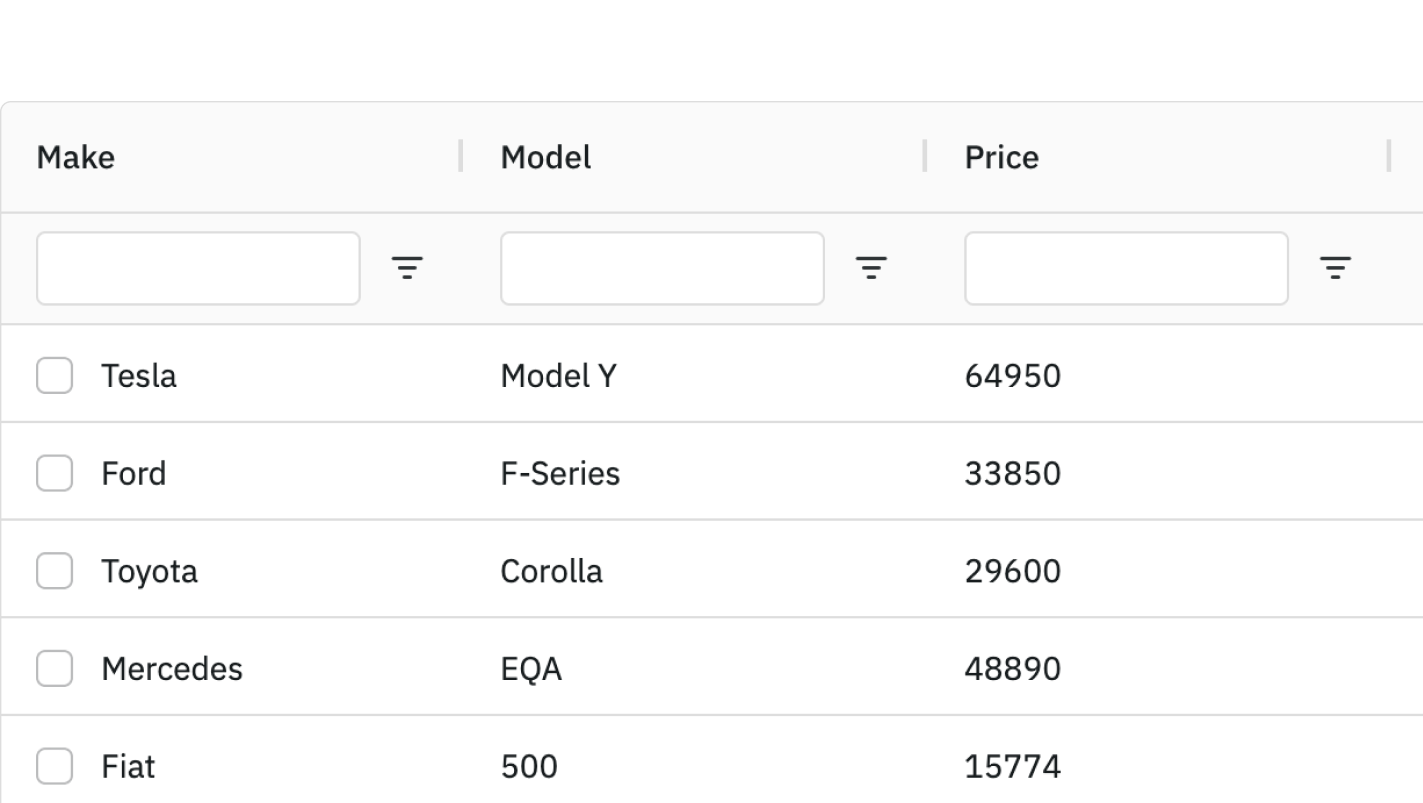
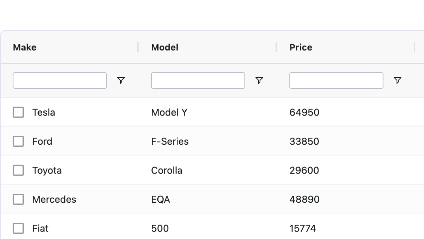
Filtering
Column Filters are embedded into each column menu. These are enabled using the filter attribute. The filter type is inferred from the cell data type.
<ag-grid-angular
    [columnDefs]="columnDefs"
    /* other grid options ... */>
</ag-grid-angular>

this.columnDefs = [
    { field: "make", filter: true },
];
There are 5 Provided Filters which can be set through this attribute. You can also create your own Custom Filter.
Floating Filters embed the Column Filter into the header for ease of access.
<ag-grid-angular
    [columnDefs]="columnDefs"
    /* other grid options ... */>
</ag-grid-angular>

this.columnDefs = [
    { field: "make", filter: true, floatingFilter: true },
];
Editing
Enable Editing by setting the editable attribute to true. The cell editor is inferred from the cell data type.
<ag-grid-angular
    [columnDefs]="columnDefs"
    /* other grid options ... */>
</ag-grid-angular>

this.columnDefs = [
    { field: "make", editable: true },
];
Set the cell editor type using the cellEditor attribute. There are 7 Provided Cell Editors which can be set through this attribute. You can also create your own Custom Editors.
<ag-grid-angular
    [columnDefs]="columnDefs"
    /* other grid options ... */>
</ag-grid-angular>

this.columnDefs = [
    {
        field: "make",
        editable: true,
        cellEditor: 'agSelectCellEditor',
        cellEditorParams: {
            values: ['Tesla', 'Ford', 'Toyota'],
        },
    },
];
Sorting
Data is Sorted by clicking the column headers. Sorting is enabled by default.
Row Selection
Row Selection is enabled using the rowSelection attribute. Use the checkboxSelection column definition attribute to render checkboxes for selection.
<ag-grid-angular
    [columnDefs]="columnDefs"
    [rowSelection]="rowSelection"
    /* other grid options ... */>
</ag-grid-angular>

// Column Definitions: Defines the columns to be displayed.
this.columnDefs = [
    { field: "make", checkboxSelection: true },
];
this.rowSelection = 'multiple';
Pagination
Enable Pagination by setting pagination to be true.
<ag-grid-angular
    [pagination]="pagination"
    [paginationPageSize]="paginationPageSize"
    [paginationPageSizeSelector]="paginationPageSizeSelector"
    /* other grid options ... */>
</ag-grid-angular>

this.pagination = true;
this.paginationPageSize = 500;
this.paginationPageSizeSelector = [200, 500, 1000];
Example
This example demonstrates filtering, editing, sorting, row selection, and pagination.
Themes & Style
Themes
Grid Themes define how the grid looks (colors, font, spacing etc). The grid comes with Provided Themes such as Quartz and Alpine. To use a theme you need to 1) import the themes CSS and 2) apply the theme to the parent HTML element of the grid.
import "ag-grid-community/styles/ag-theme-quartz.css"; // import Quartz theme
// import "ag-grid-community/styles/ag-theme-alpine.css"; // import Alpine theme, not used here
// ...
 template: `<div style="height: 100%; box-sizing: border-box;">
   <ag-grid-angular
     // ...
     [class]="themeClass"
   ></ag-grid-angular>
 </div>`,
// ...
public themeClass: string = "ag-theme-quartz";
Customising a Theme
Customise Themes using CSS variables.
.ag-theme-quartz {
    /* Changes the color of the grid text */
      --ag-foreground-color: rgb(14, 68, 145);
      /* Changes the color of the grid background */
      --ag-background-color: rgb(241, 247, 255);
      /* Changes the header color of the top row */
      --ag-header-background-color: rgb(228, 237, 250);
      /* Changes the hover color of the row*/
      --ag-row-hover-color: rgb(216, 226, 255);
}
Figma
If you are designing within Figma, you can use the AG Grid Design System to replicate the Quartz and Alpine AG Grid themes within Figma. These default themes can be extended with Figma variables to match any existing visual design or create entirely new AG Grid themes. These can then be exported and generated into new AG Grid themes.
Cell Style
Define rules to apply Styling to Cells using cellClassRules. This can be used, for example, to set cell background colour based on its value.
.rag-green {
  background-color: #33cc3344;
}
<ag-grid-angular
    [columnDefs]="columnDefs"
    /* other grid options ... */>
</ag-grid-angular>

this.columnDefs = [{
    field: 'electric',
    cellClassRules: {
        // apply green to electric cars
        'rag-green': params => params.value === true,
    }
}];
Row Style
Define rules to apply Styling to Rows using and rowClassRules. This allows changing style (e.g. row colour) based on row values.
.rag-red {
  background-color: #cc222244;
}
<ag-grid-angular
    [rowClassRules]="rowClassRules"
    /* other grid options ... */>
</ag-grid-angular>

this.rowClassRules = {
    // apply red to Ford cars
    'rag-red': params => params.data.make === 'Ford',
};
Example
This example demonstrates cell style and row style.
Next Steps
- Read our Introductory Tutorial.
- Watch our Video Tutorials.