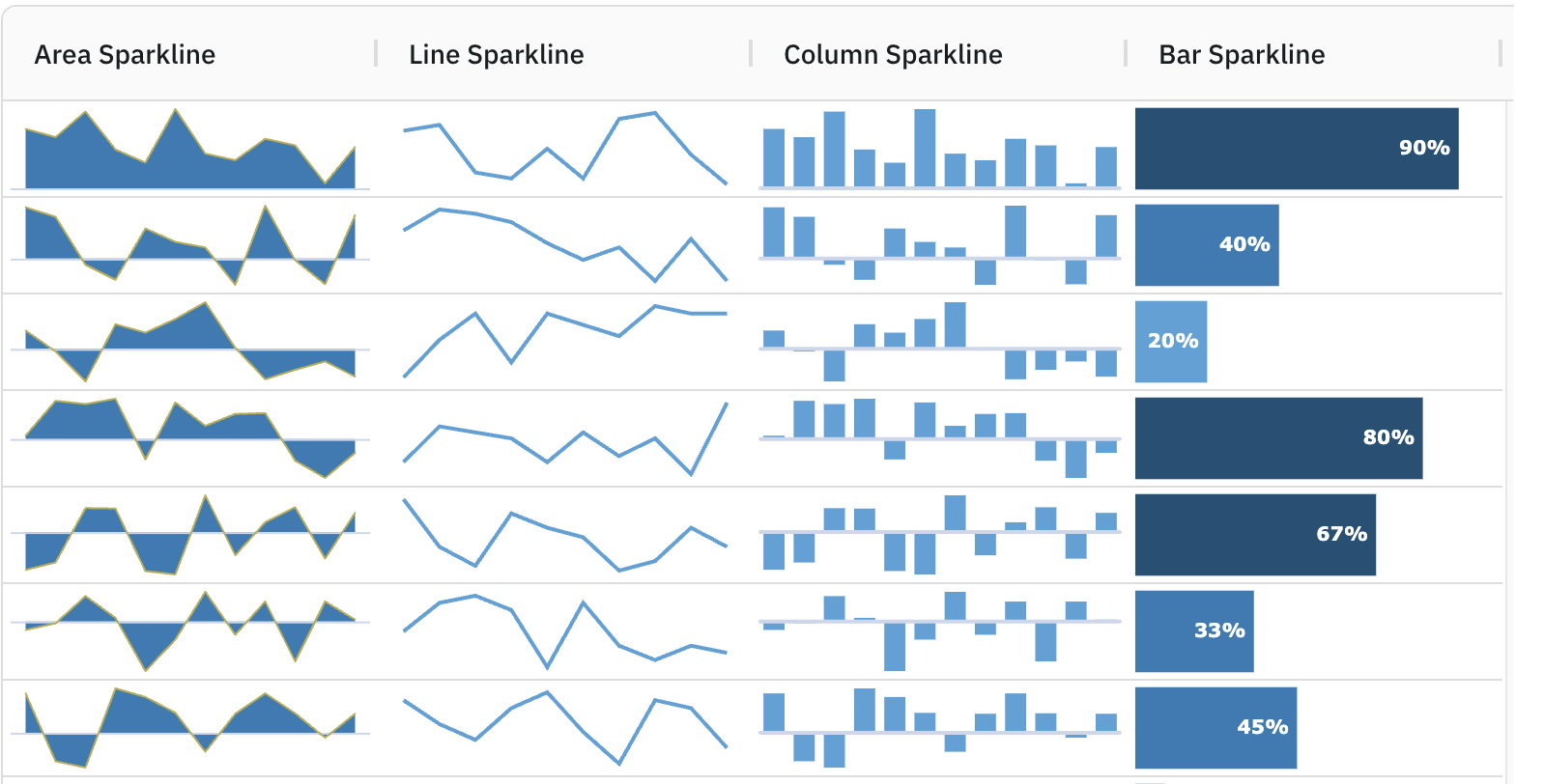
This section introduces the grid's built-in Sparklines - mini charts that are optimised for grid cells that can be used to provide insights into data trends at a glance. These sparklines can be fully customised to application's requirements.
Enabling Sparklines Copy Link
To enable sparklines on a particular column, add the agSparklineCellRenderer as shown below:
const [columnDefs, setColumnDefs] = useState([
    {
        field: 'change',
        cellRenderer: 'agSparklineCellRenderer',
    },
    // other column definitions ...
]);

<AgGridReact columnDefs={columnDefs} />
Note in the snippet above that specifying an agSparklineCellRenderer will display the data using the default line sparkline.
The following example shows the minimum configuration required to display data in a sparkline. Note the following:
- The Change column is configured to use an
agSparklineCellRenderer. - No sparkline options are supplied to the
agSparklineCellRendererso the default Line Sparkline is used. - An array of numbers is supplied as data to the Change column, which means no Data Mapping is required.
Sparkline Customisation Copy Link
The default Sparkline options act as a good starting point for most applications, however sparklines can be fully customised by overriding the default sparkline options.
Sparklines are customised by supplying sparklineOptions to the cellRendererParams on the Sparkline Cell Renderer as shown below:
const [columnDefs, setColumnDefs] = useState([
    {
        cellRenderer: 'agSparklineCellRenderer',
        cellRendererParams: {
            sparklineOptions: {
                // Sparkline customisation goes here.
            }
        },
    },
    // other column definitions ...
]);

<AgGridReact columnDefs={columnDefs} />
Each Sparkline type contains specific sparklineOptions that can be overridden and are covered in the following sections:
The following sections are relevant to all sparkline types:
- Sparkline Data - compares the different data formats that can be supplied to sparklines.
- Axis Types - compares the different axis types available to sparklines.
- Sparkline Tooltips - covers the various ways sparkline tooltips can be customised.
- Points of Interest - shows how points of interest can be formatted on sparklines.
- Sparklines API - shows more details on APIs available when using sparklines.